Pine
role
Product Design Intern
team
2 designers, 2 engineers, Head of Product, CEO
timeline
May 2025 - Aug 2025
skills
UI/UX Design, Design Systems, Interaction Design, Tailwind CSS, Next.js, Usability Testing
overview
Leading the full rebrand + redesign of Pine's product suite: web app, mobile app, internal dashboard, and design system

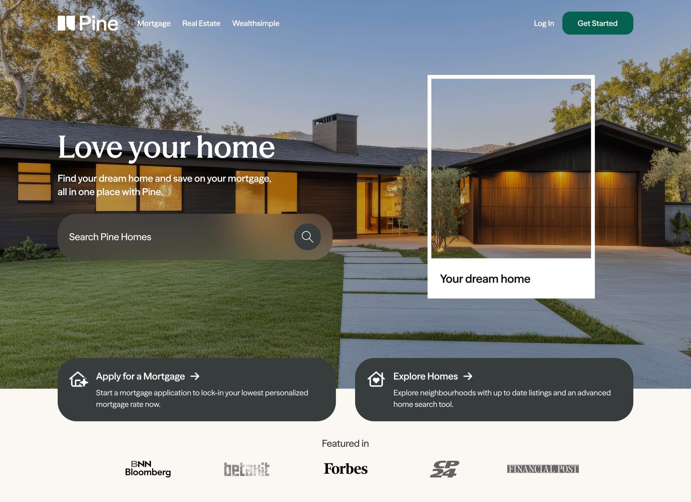
This past summer, I joined Pine as a product design intern with one mission: completely rebrand and redesign their entire product suite. Pine is a Canadian fintech operating as a digital mortgage lender and real estate brokerage, offering end-to-end home buying and selling all in one place.
As the only other designer on staff, I was given full ownership of the redesign. From brand identity to web app, mobile app, internal dashboard, and design system - I led it all.
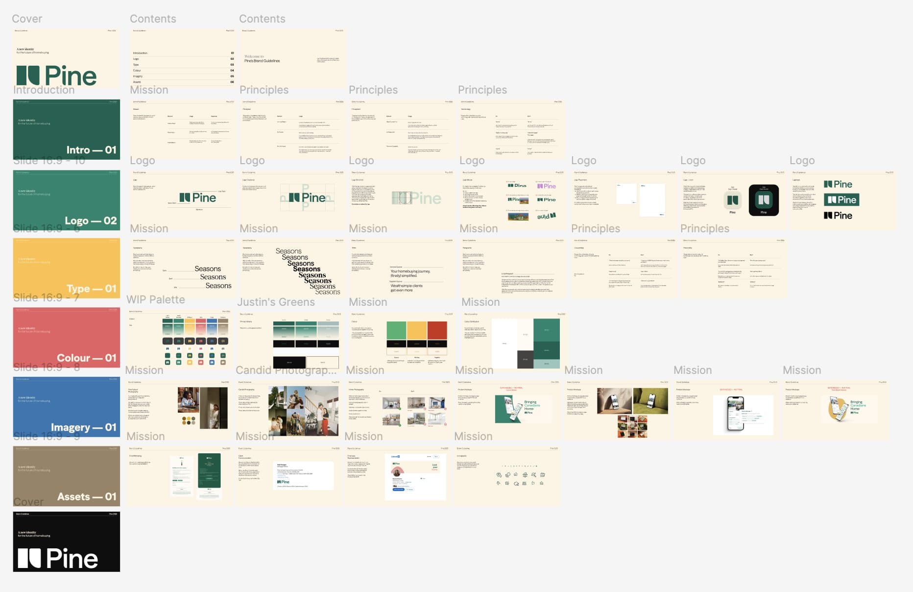
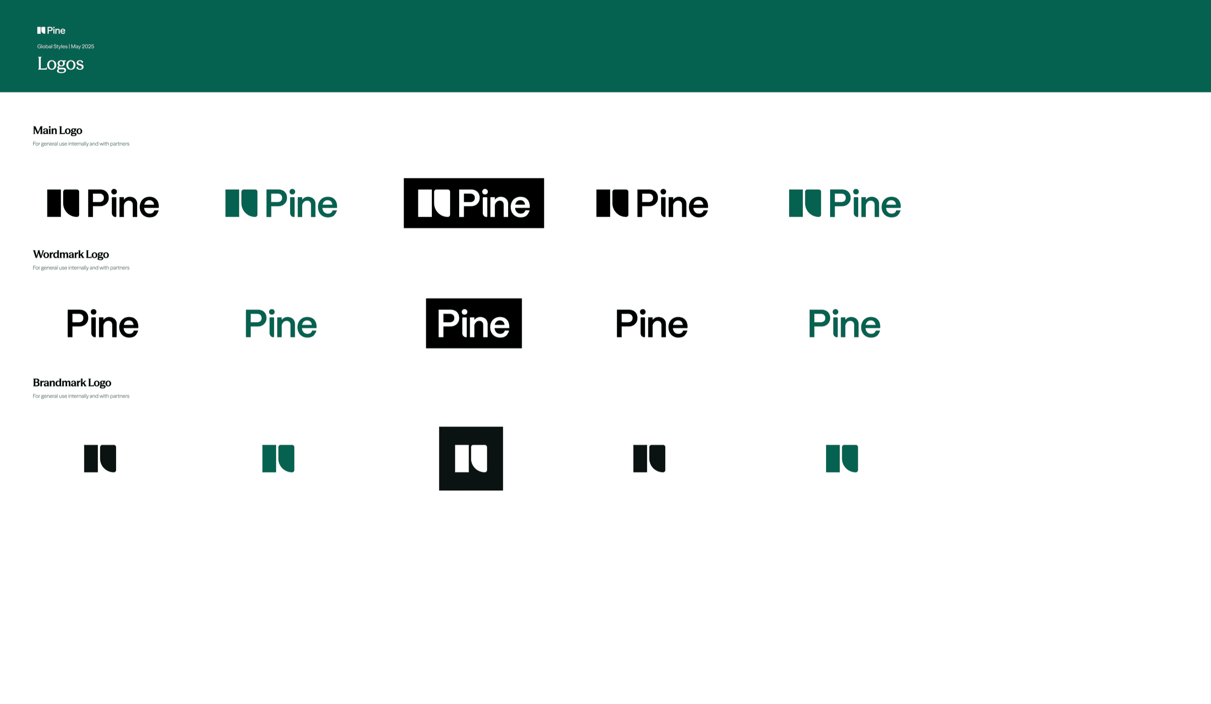
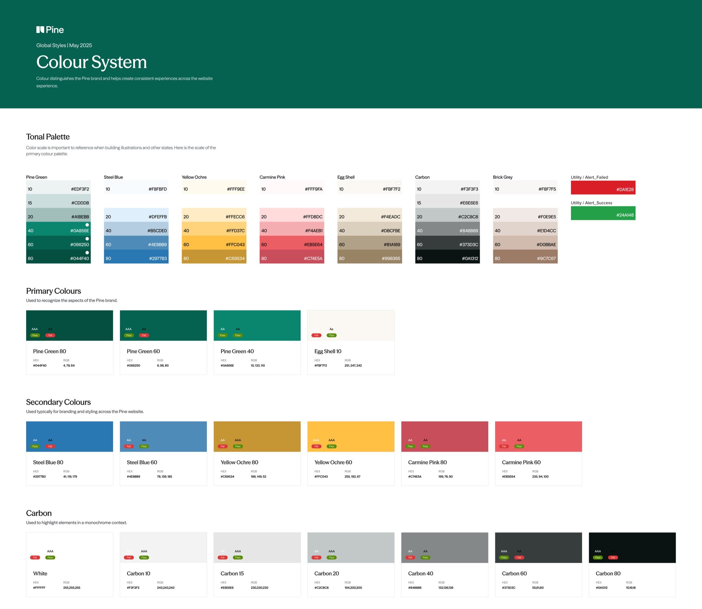
brand guidelines
Developed Pine's brand guidelines covering identity, typography, colour, and component usage across all surfaces.
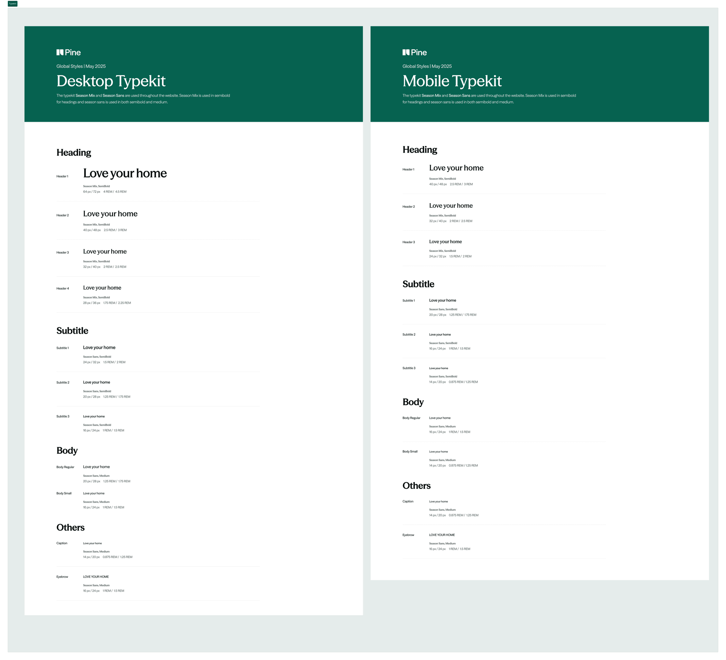
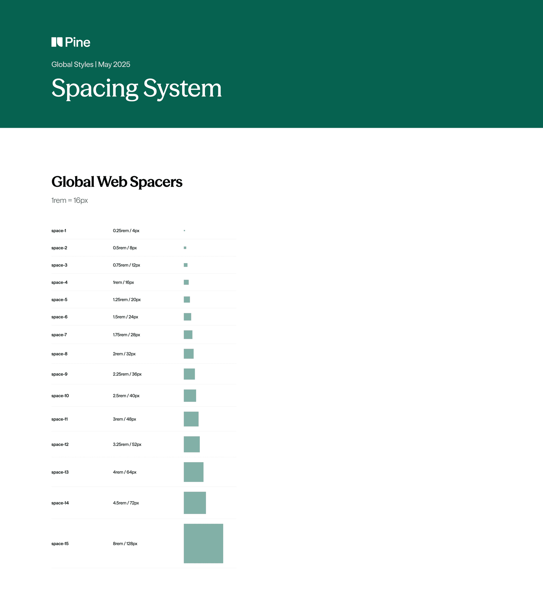
design system
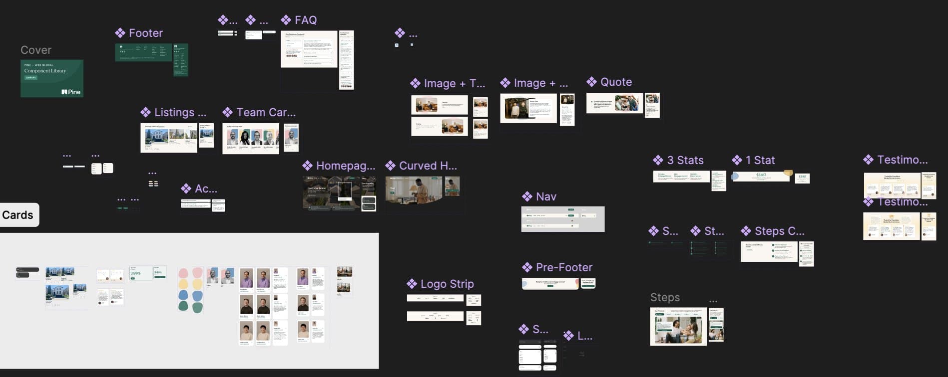
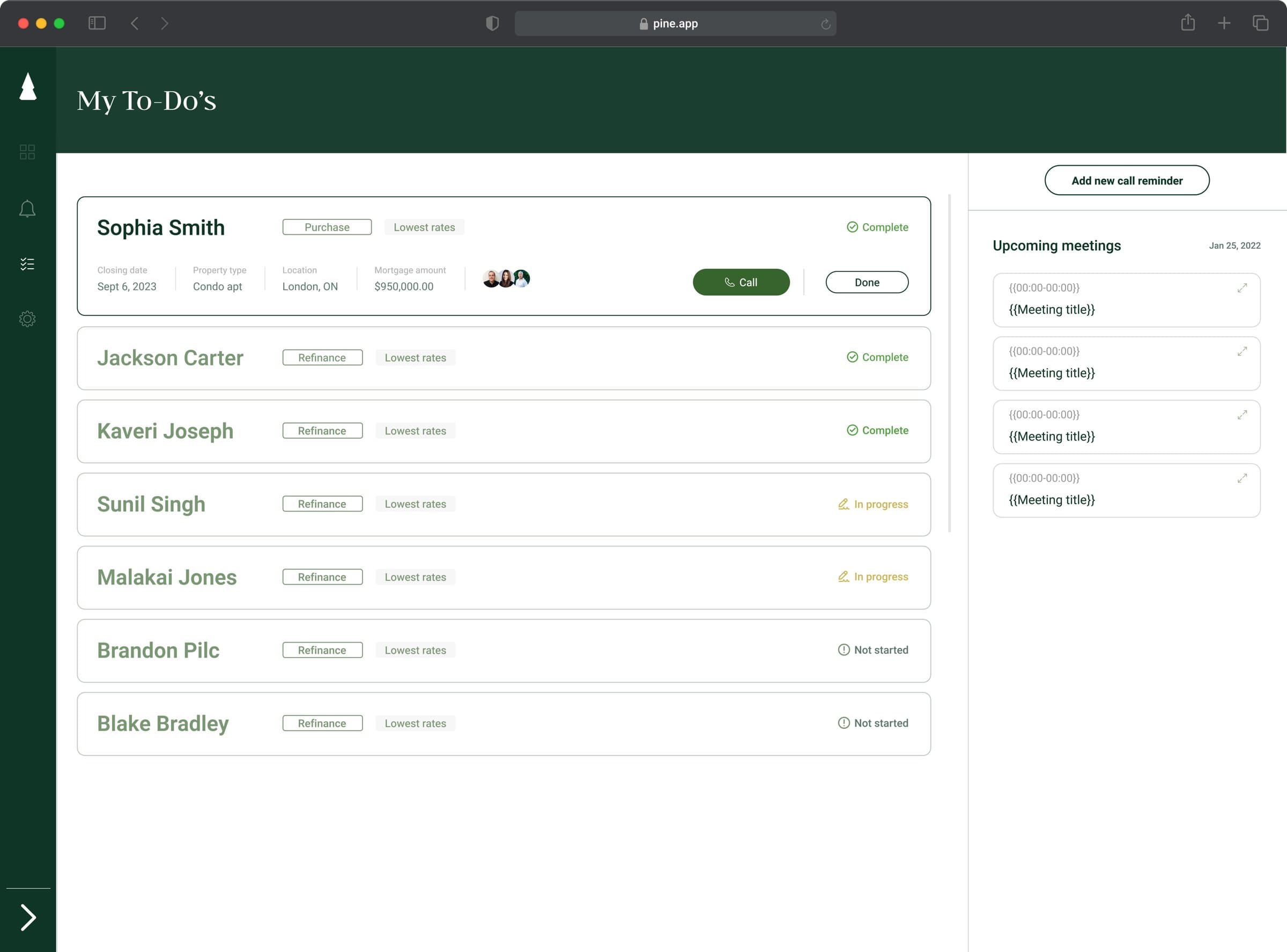
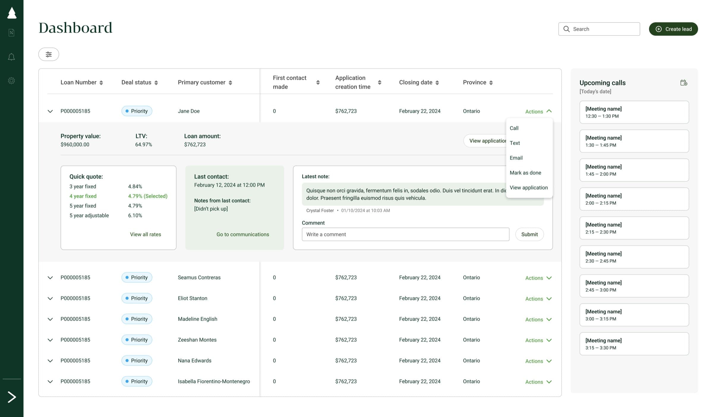
Built Pine's design system and a component library of 60+ reusable components, adopted across the entire product suite.
pine homes
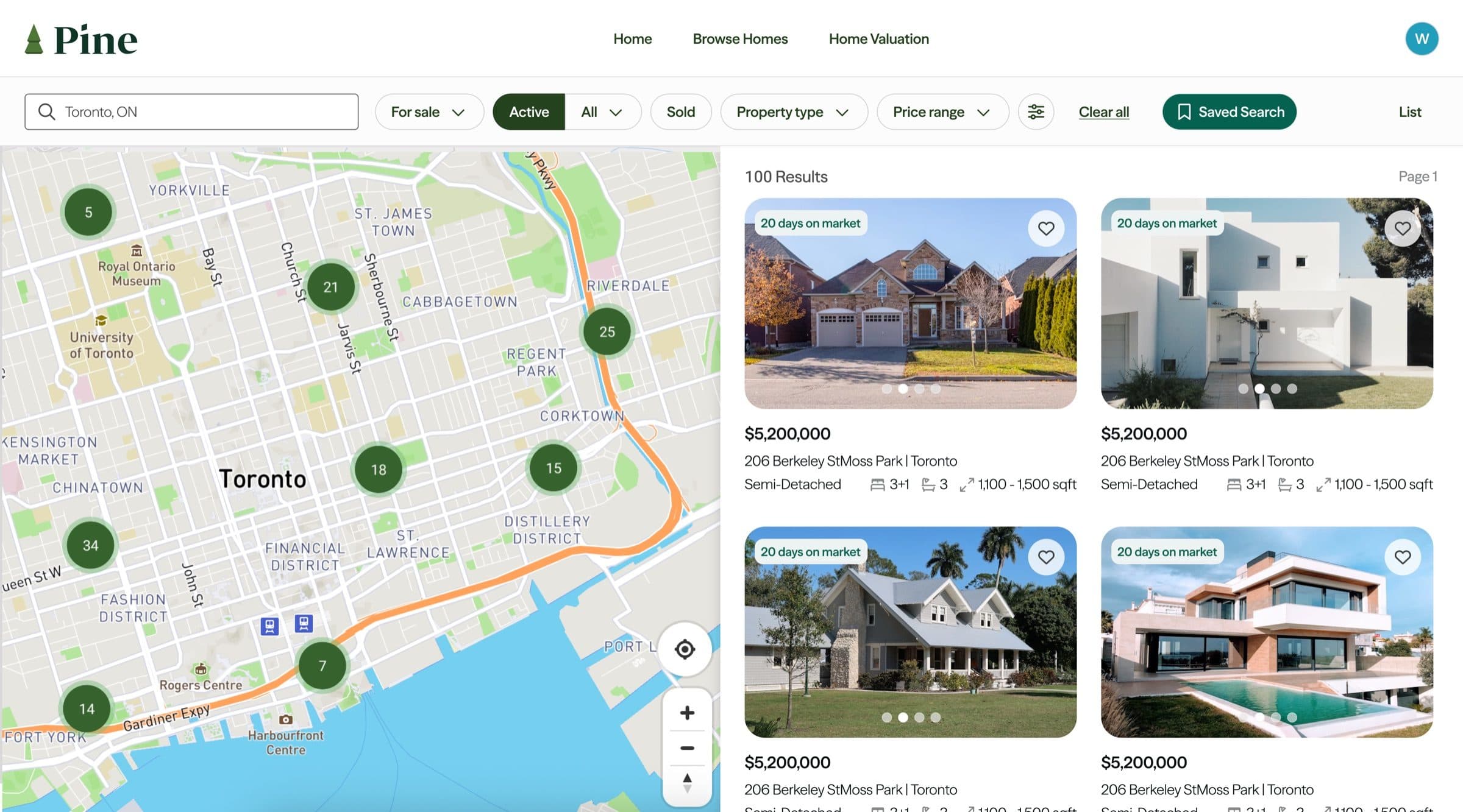
Designed Pine Homes - an integrated real estate search experience across web and mobile.
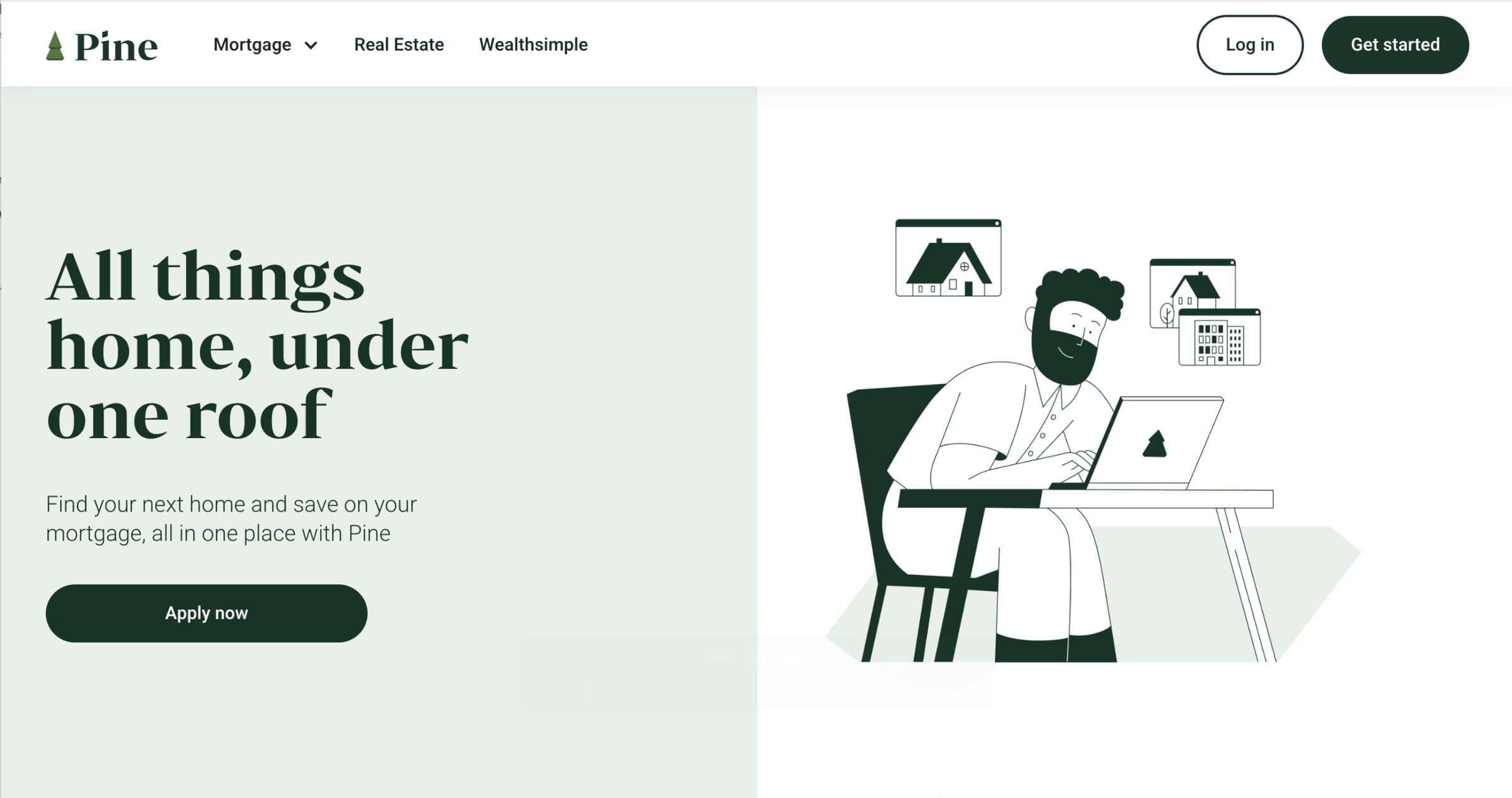
Old Pine Homes: minimal features, underdeveloped UI/UX, and no personalized user pages.
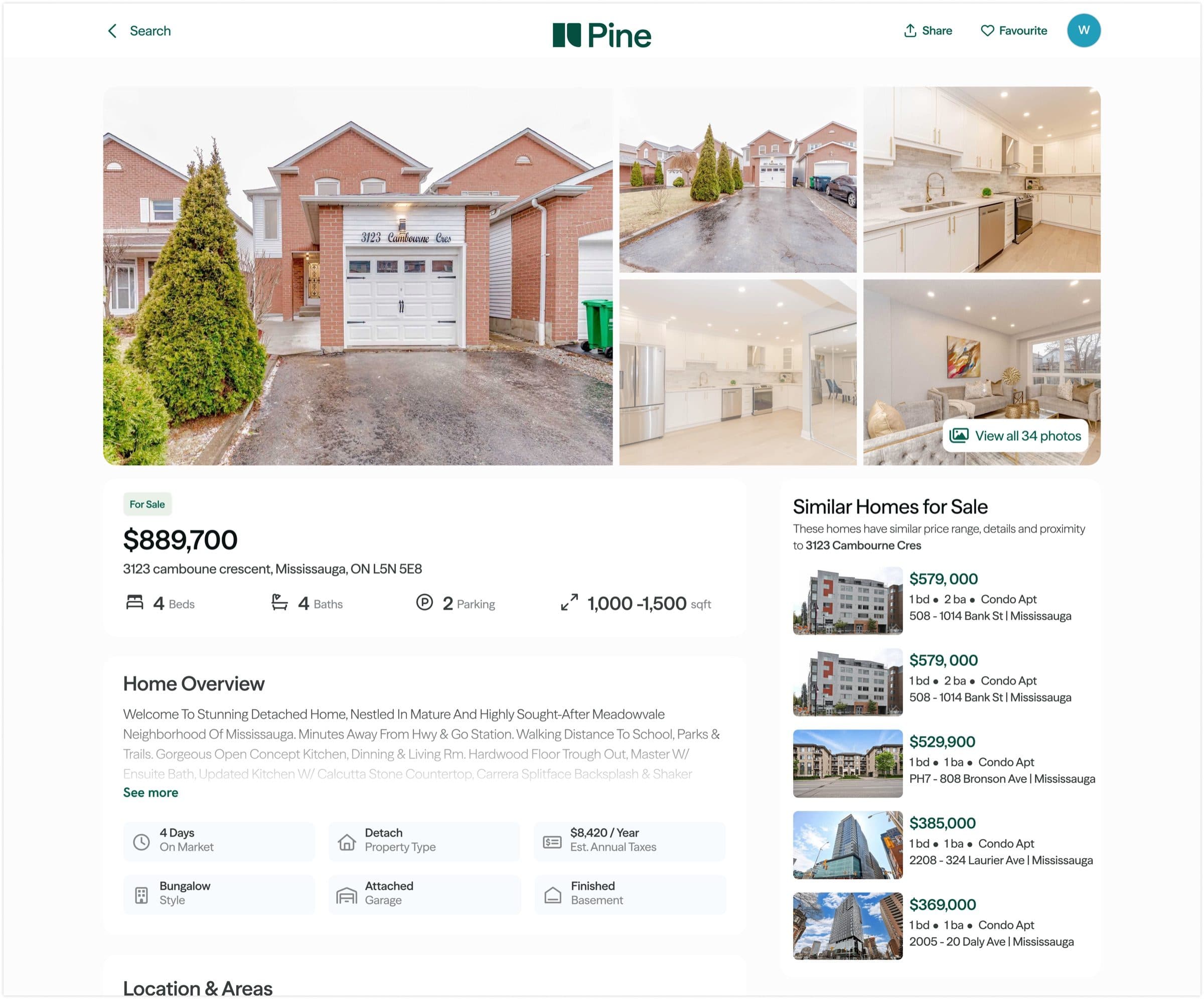
New Pine Homes: a fully redesigned listing experience with custom property pages and a personalized user journey.
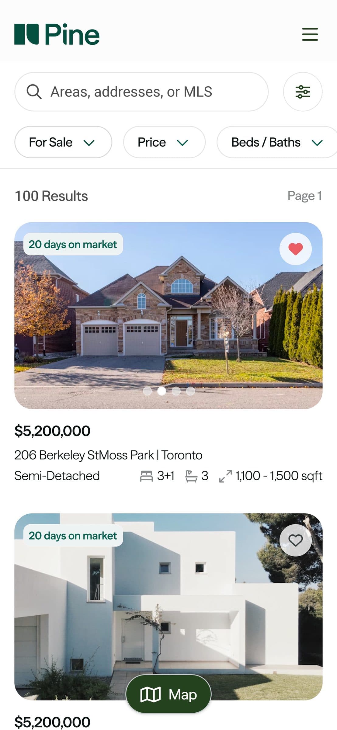
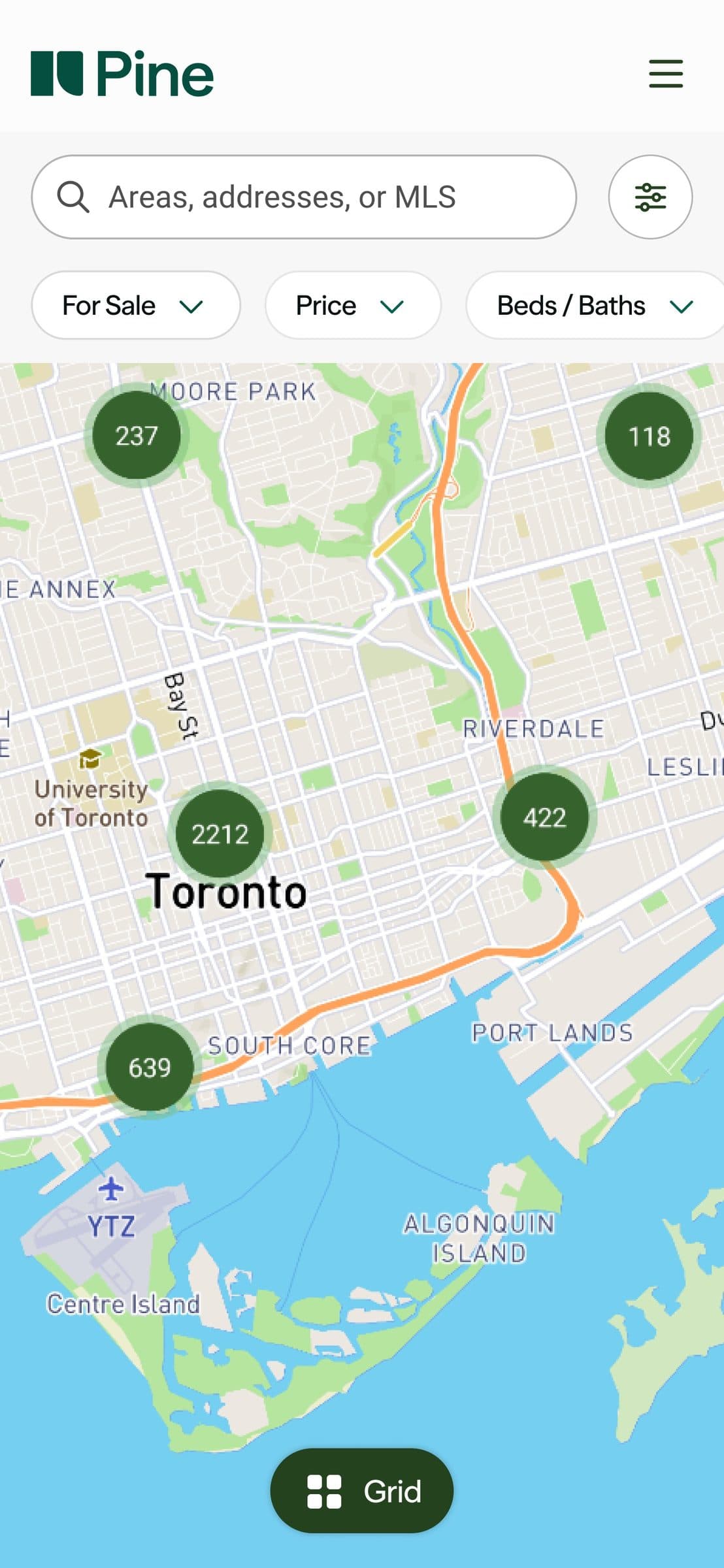
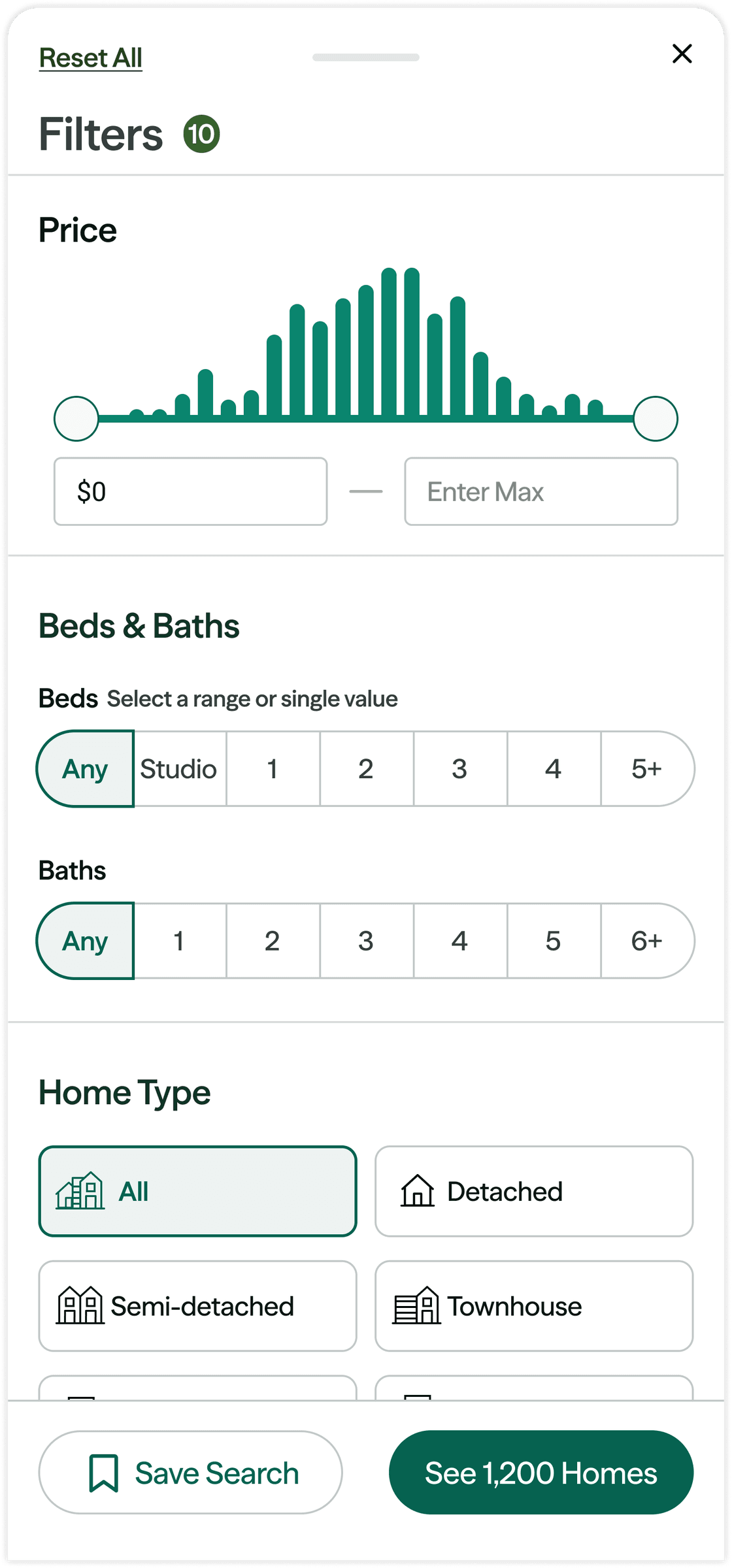
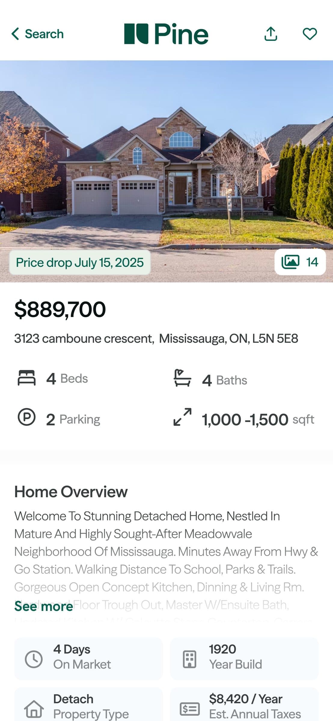
Some of the screens for the Pine Homes mobile app. Click here to download the app, click here to see the Pine Homes web experience, and click here to see the Pine Homes design process.
reflections
Designing for consistency across surfaces
Designing across a web app, mobile app, internal dashboards, and a brand system simultaneously forced me to think in systems, not screens. A decision made in the design system would ripple into every surface, so I learned to slow down on foundational decisions and move fast on surface-level ones. That discipline of knowing where consistency was non-negotiable and where flexibility was healthy, became the backbone of how I approached the entire rebrand.
The user is always right
One of the most humbling parts of this project was realizing that what felt intuitive to me as the designer wasn't always intuitive to the people actually using the product. I spent real time understanding Pine's users: their mental models, pain points, and the flows they naturally gravitated toward. That research consistently challenged my assumptions. Features I thought were obvious needed rethinking, and flows I thought were clever turned out to be friction in disguise. It reinforced that good UX isn't about what the designer thinks is best, it's about what actually works for the person on the other end of the screen.
Building for the team, not just the user
A design system isn't a product for users, it's a product for your team. I learned quickly that components needed to be just as intuitive for the engineers building them as they were for the users experiencing them. At Pine, with such a lean team, I became the bridge between design intent and implementation reality. Designing with that dual audience in mind pushed me to document more thoughtfully, name things more deliberately, and think beyond the Figma file.